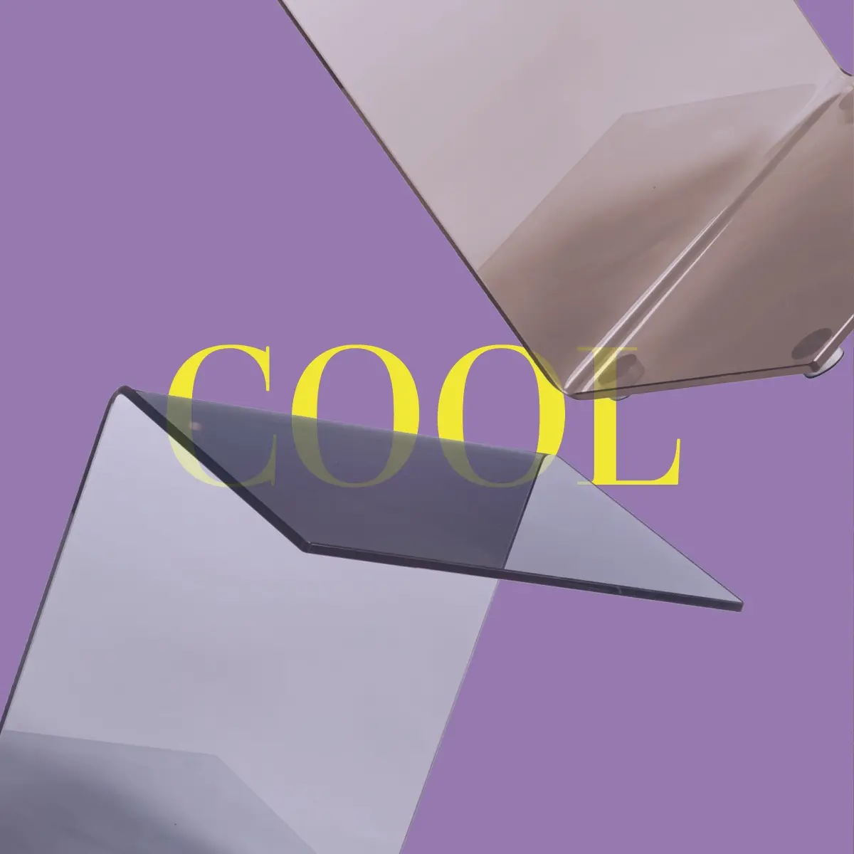
Designwerk editorial composition with sculptural glass furniture and typography
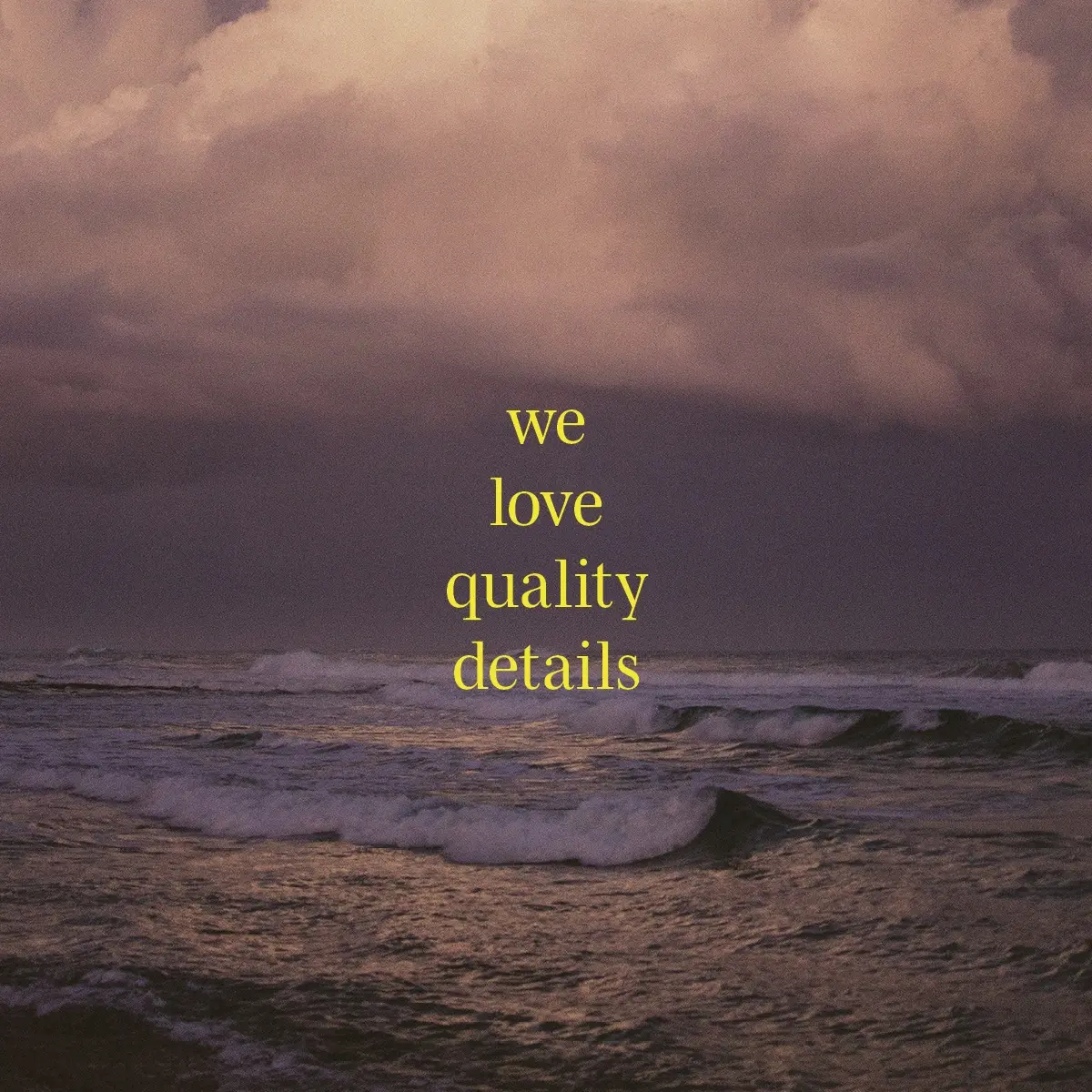
Designwerk editorial seascape with the statement we love quality details

EDITORIAL DESIGN / PROJECT 01

TWO MAGAZINES. ONE EVOLVING EDITORIAL WORLD.

Across two large-format editions, I developed a visual world beyond the conventions of a furniture catalogue. Architecture, nature and culture give every issue its own character while keeping Designwerk recognisable.

FORMAT AS NARRATIVE

DESIGNED TO BE SEEN, HELD AND UNFOLDED.

BOTH EDITIONS OPEN FROM DIN A3 INTO A DIN A1 POSTER.

The poster is the magazine cover: folded around each DIN A3 edition and held closed by a textile band. Poster, fold, typography and image sequence were conceived as one physical experience — from the first encounter to the completely unfolded story.
CLIENT
DESIGNWERK
EDITIONS
2023/24 + 2024/25
FORMAT
TWO DIN A3 IMAGE MAGAZINES / DIN A1 FOLD-OUT POSTER COVERS
ROLE
ART DIRECTION / EDITORIAL DESIGN / STORYTELLING / DIGITAL ROLLOUT

INVITATION CONCEPTS / PRINT + MOTION

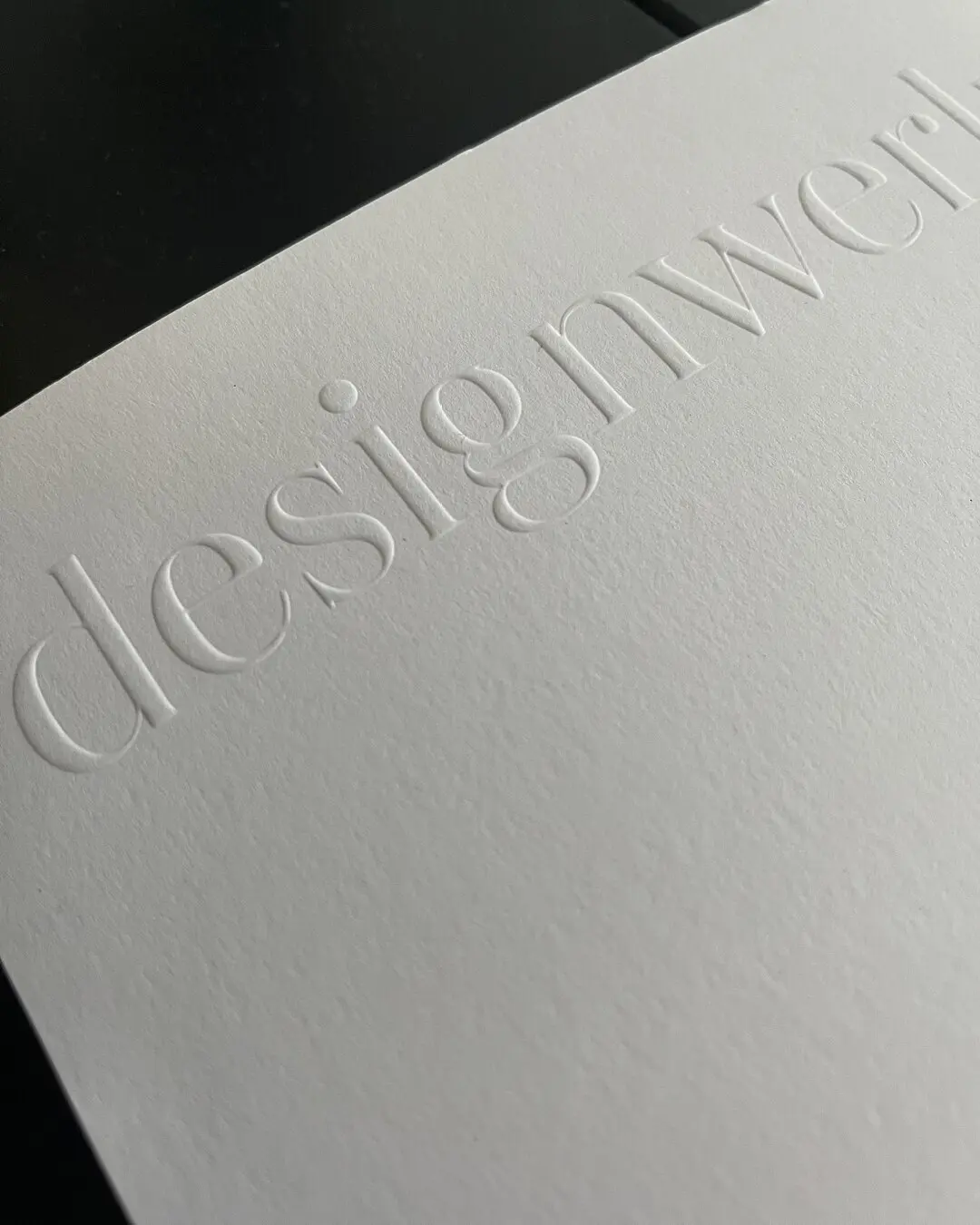
Embossed cards and envelopes, alongside an individual postcard set for Salone del Mobile Milano, extend the editorial world into a tactile first encounter. Every invitation for the international furniture fairs was also adapted as an animated GIF — translating the same concept from print into motion.

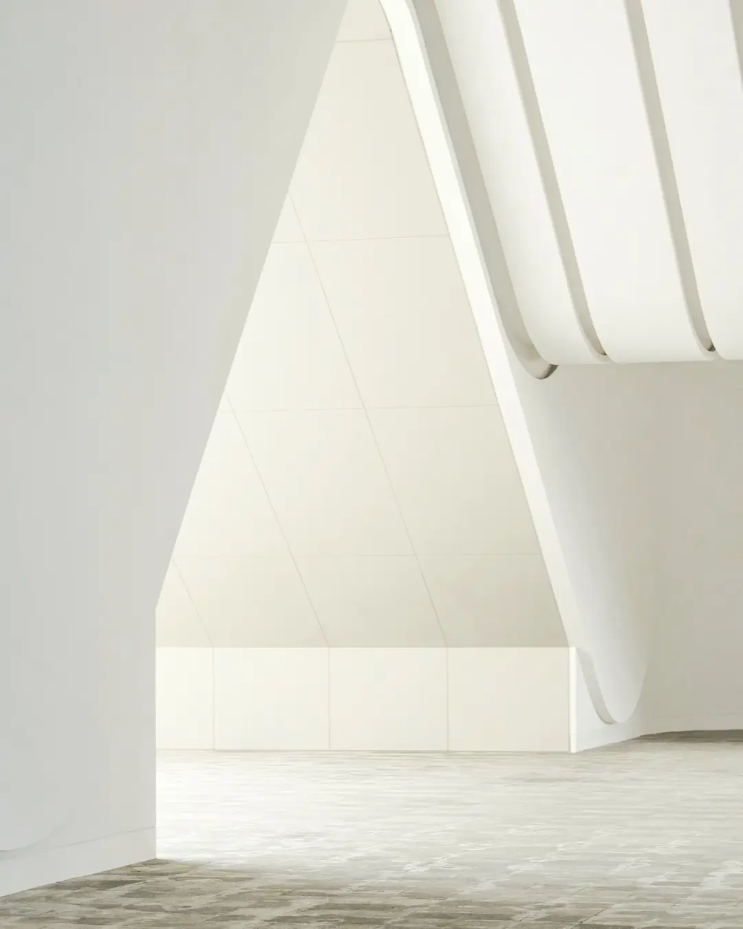
White sculptural architecture selected for the Designwerk editorial world
Embossed Designwerk invitation detail
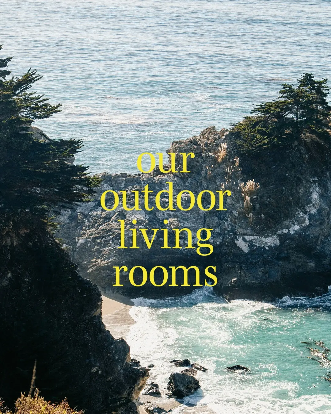
Coastal landscape with Designwerk outdoor living typography
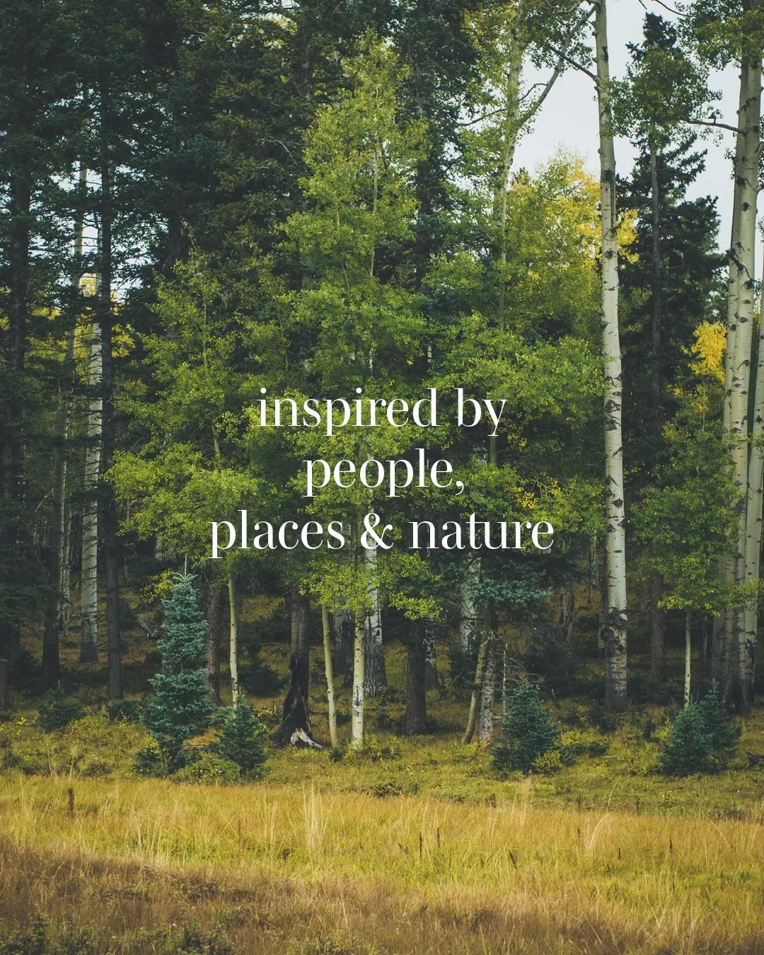
Forest landscape with an editorial statement about people, places and nature
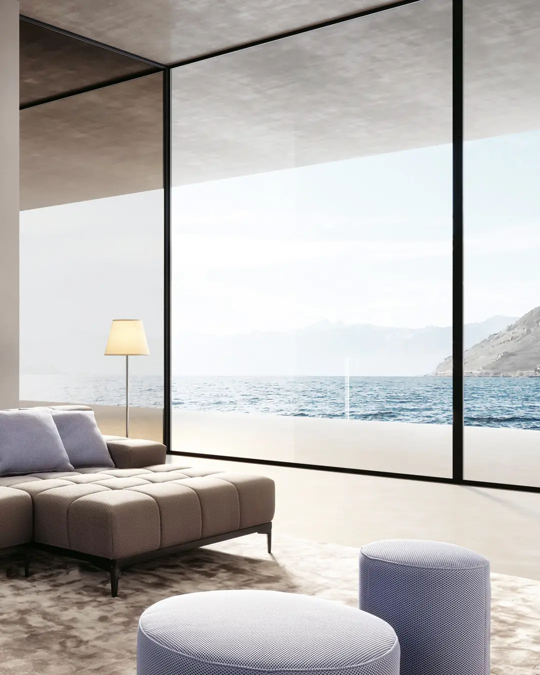
Designwerk interior overlooking the sea
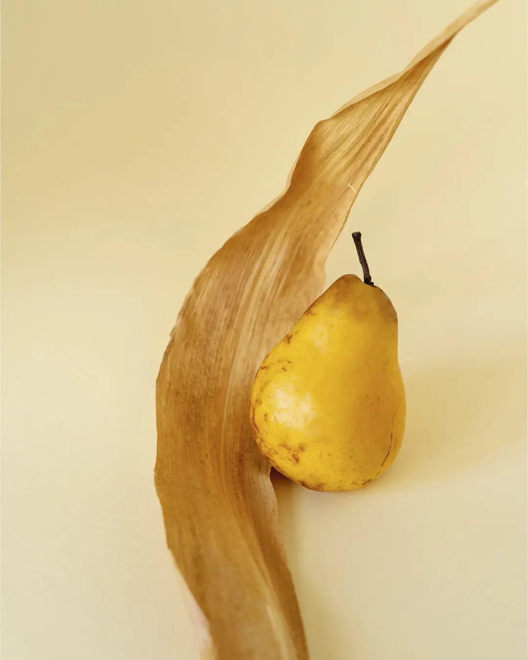
Pear and dried leaf still life used in the Designwerk magazine
Animated Designwerk M.O.W. invitation with yellow logotype
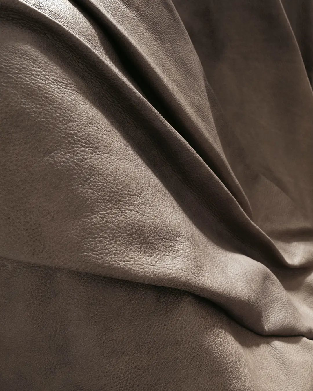
Close-up study of soft leather folds
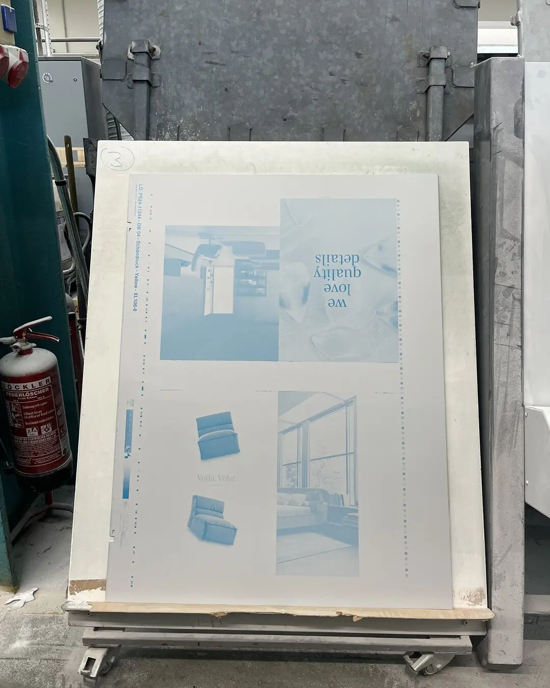
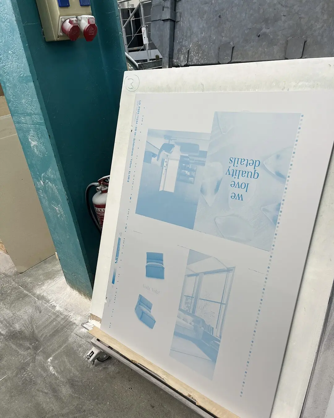
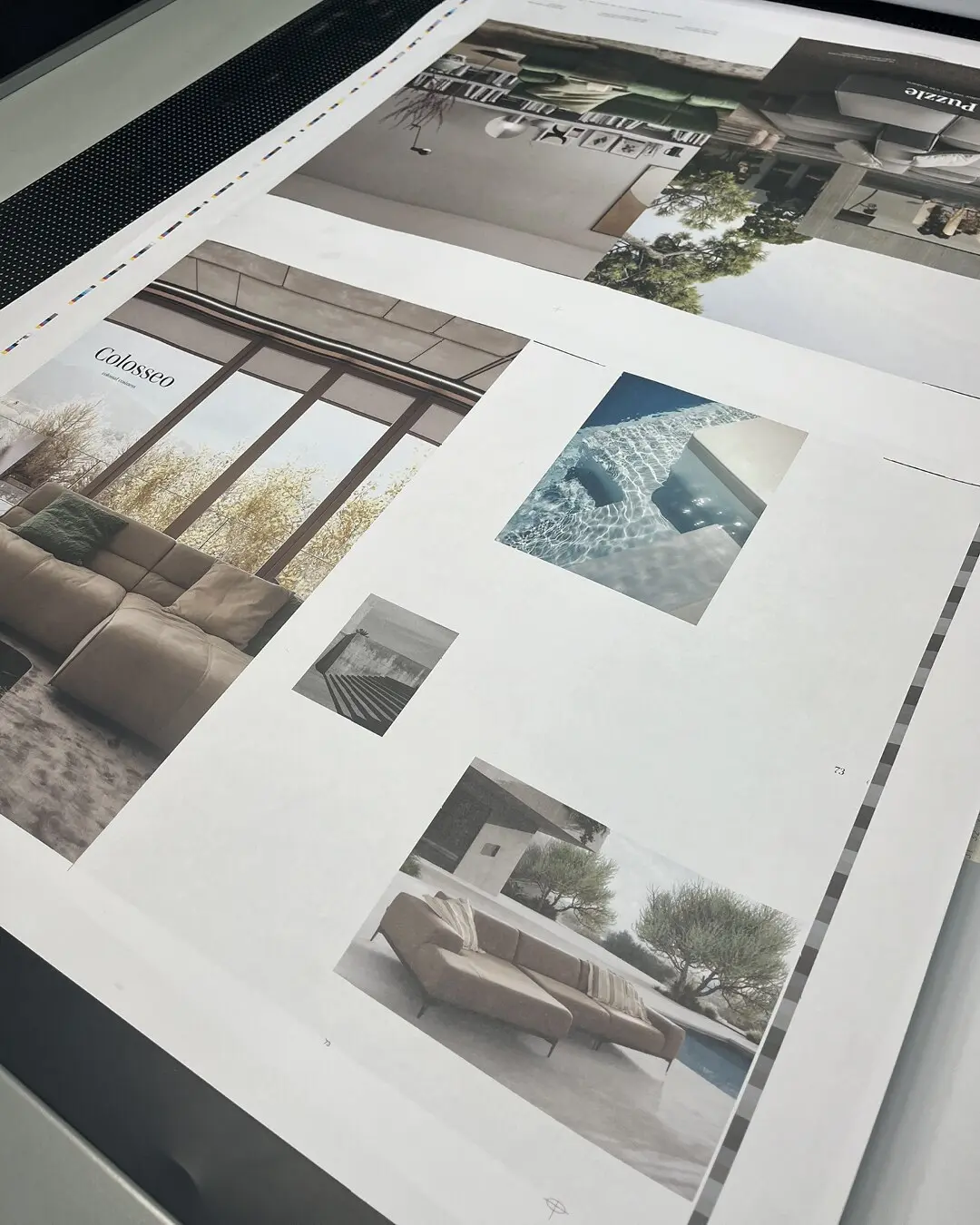
Designwerk magazine printing plate prepared for production
1

DESIGNWERK IMAGE MAGAZINE / 2023—24

AN EDITORIAL PLAYGROUND.

Lime, lilac and unexpected pairings create an expressive rhythm. Furniture meets landscape, art and culture — giving the collection a point of view.

CLICK ANY SPREAD TO OPEN THE COMPLETE ISSUE
2

DESIGNWERK IMAGE MAGAZINE / 2024—25

A QUIETER, MORE ARCHITECTURAL RHYTHM.

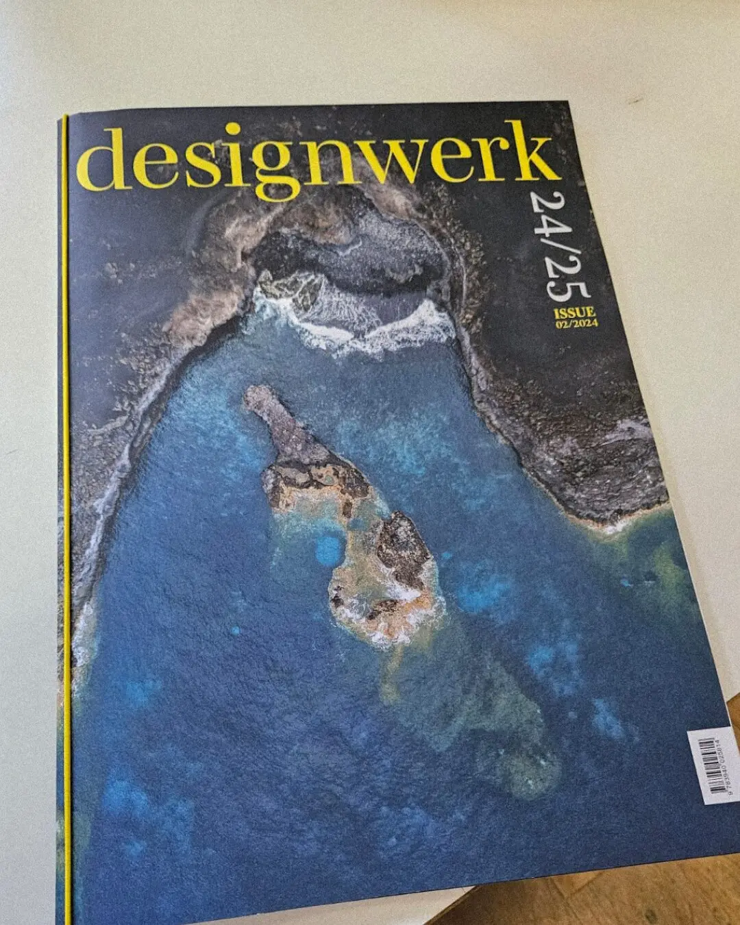
Forest green, earth tones and sharp yellow typography evolve the system. Larger images and calmer compositions give both product and nature more space.

CLICK ANY SPREAD TO OPEN THE COMPLETE ISSUE

MATERIAL / PRODUCTION / QUALITY

FROM PRESS CHECK TO FINISHED OBJECT.

Designwerk magazine printing plate during production
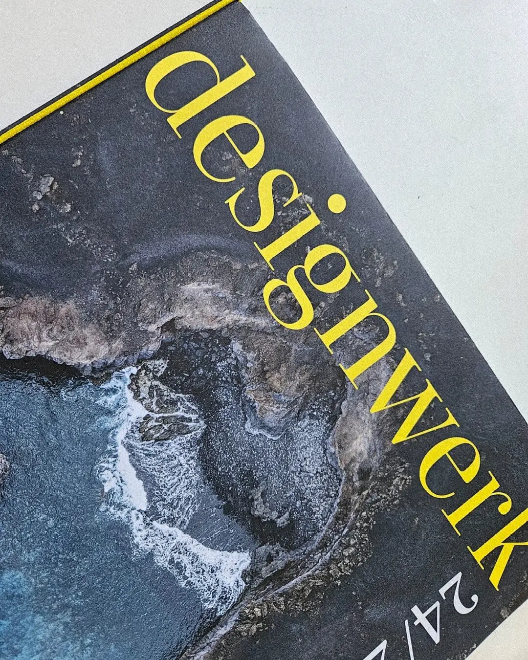
Finished large-format Designwerk magazine
Designwerk magazine press sheet during quality control
Detail of the printed Designwerk 2024/25 cover

PRINT PRODUCTION

QUALITY IS PART OF THE CONCEPT.

I stay closely involved in paper selection, colour proofs, press checks and finishing, with a strong focus on material, precision and lasting quality. The generous DIN A3 format gives imagery and typography room to breathe, while the fold-out DIN A1 poster cover turns each edition into a distinctive editorial object with a unique physical character.

PROJECT 01 / DESIGNWERK / 2023—2025

FROM THE FIRST IDEA TO THE FINAL ROLLOUT.

I led concept, storytelling, image direction, editorial pacing and execution. Two distinct editions form one evolving brand world across print and screen.

EDITORIAL CONCEPTART DIRECTIONSTORYTELLINGLAYOUT & TYPOGRAPHYPRINT PRODUCTIONDIGITAL ASSETS

EDITORIAL DESIGN / SELECTED WORK

PROJECT 01 — DESIGNWERK

NEXT PROJECT — BUGATTI / FALL—WINTER 2026 →